How Do You Set Up a Photo Corner Guests Actually Use (and Love)?
A wedding photo corner is a straightforward thing: you find a place, set up a background, and put out some props, and you are good to go. And yet, many photo areas look lovely… but remain empty all night. Guests may feel uncomfortable, the lighting might be too harsh, or the installation may be tucked away in a corner where people just pass by without looking.
The good news is that creating a photo corner that actually gets used doesn’t mean spending more money. It is all about making it look easy. When guests instantly know where to stand, what to do, and why it will look good, they will leap into it—especially once the first few groups jump in.
Here is a real-life tested method for arranging a photo booth that wedding attendees will adore (and visit again and again).
Begin with the “why”: what type of photos would you like?
You want this corner to do something on your day, so you have to decide what you want it to be before you purchase props or select a backdrop. Everything else is influenced by that answer.
Ask yourself:
- Would you like smooth, statuesque portraits (grandparents, family groups, formal appearances)?
- Would you prefer playful, wild, flirtatious moments (friends, dancing spirit, silliness)?
- Would you like a mix—cute at the start, silly later on?
If you desire polished shots, you should concentrate on flattering light and a clean background, and the volume of props should be reduced. If you want to have fun, you will lean towards signs, prompts, bold props, and a layout that invites groups to stack in.
This quick thinking prevents you from creating something that looks fashionable, yet is not in line with the vibe of your crowd.
Choose a place that guests pass through naturally, without traffic congestion.
The number one reason photo corners fail is simple: guests simply do not see them, or they believe they are getting in the way if they use them.
Look for a location within the natural flow of traffic, such as:
- Near the bar (but not in the queue).
- On the route to the restrooms (not at the door—near, but not too near).
- Near the reception entrance or around the perimeter of the dance floor.
- Next to the guest book or gift tables (without being crammed).
Do not go down narrow corridors, through clumsy dead-ends, or behind pillars. You just need a place where you and your small party can meet, snap photos, laugh, and move on, without feeling as though everyone is staring at you.
A personal rule that works: if you can comfortably fit 3-6 people in the background of the shot and leave enough room for someone to take the photo several steps away, you are okay.
Self-evident: the one-step photo corner.
Your photo corner must be recognizable from across the room. Guests should not have to ask themselves, “Is this allowed?” or “How does this work?”
Design it so guests can do this in a single step:
- Walk up.
- Pose in the obvious photo spot.
- Take the photo instantly.
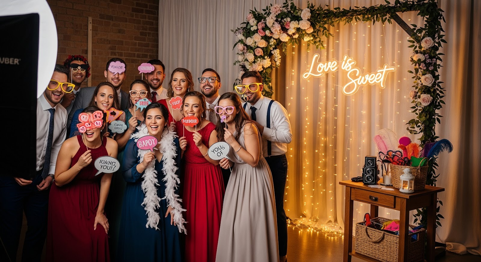
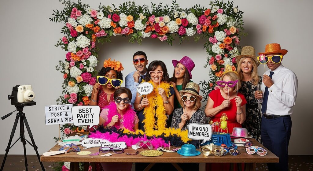
To make that happen, place a visual cue that says, “Stand here.” This is where a frame prop works exceedingly well since it literally lets people know where the picture happens. One large, creatively positioned WEDDING SELFIE FRAME can eliminate awkwardness and convert the installation into an interactive experience, rather than just a decorated wall.
Also, consider a small sign with a very brief call-to-action such as:
- “Snap a pic!”
- “Take a photo + tag us”
- “One for the happy couple!”
Keep wording minimal. The goal is not a reading task but instant comprehension.
Lighting is everything (and is often the missing piece).
If your photos appear dark, yellow, or grainy, people will never want to return to take another look, no matter how beautiful the corner is. Lighting is the difference between a corner used once and one used all night.
Here are simple lighting options that can be used:
- Ring light on a tripod: This is the simplest all-in-one solution, particularly when guests are using phones.
- Soft LED panel lights: These are excellent in dim locations where you want to appear more professional.
- Lights behind a thin curtain: Fairy lights create atmosphere, but ensure there is still enough light on faces.
- Venue background lighting: Works as a background, but is hardly sufficient to light faces.
Quick test: Stand in the same position as the guests will, take some selfies and a back-camera picture, and check the skin tones. If faces appear dark or excessively orange, change the direction of the light or its intensity.
If you are outdoors as the sun sets, plan for what to do when it gets dark. It is easy to find photo corners that have a good beginning and then just fizzle out as the light shifts.
Create a background that is attractive on camera, not just to the naked eye.
There are some backgrounds that appear spectacular to the eye, but look flat (or unattractive) in photographs. Prioritize design that works for cameras:
- Select 2-3 primary colors that go with your wedding colors.
- Add depth: layers take better pictures than single sheets of paper.
- Keep the center neat where faces go—busy patterns are distracting.
- Avoid shiny surfaces so flash doesn’t reflect into the lens.
Simple, inexpensive background packages:
- Curtains + fairy lights + clusters of greenery.
- Matte cloth + balloon garland (held to the side so it doesn’t cover faces).
- Wooden wall + florals in the corners.
- Framed decoration items and a plain wall.
When building your own setup, shoot some test shots using different phone models. What appears huge on your phone may look dark on someone else’s.
Add props that promote groups (not individual photos).
If you want guests to use the corner, make it group-friendly. When people can hide behind a silly sign or squeeze in with friends, they feel less awkward.
Pick props that:
- Are easy to hold with one hand.
- Don’t block faces completely.
- Match your mood (romantic, playful, elegant, retro, etc.).
- Can be reset quickly.
The best option is to have a small, curated set of props rather than a cluttered pile. Too many props can look like a kids’ party and make the space messy very quickly. A well-dressed basket of 8 to 12 choices is sufficient.
Also, think of things like “prompt props” which generate action, e.g.:
- “Best dance move” sign.
- “Bride’s side / Groom’s side”.
- “We came for the cake”.
Prompts help guests decide what to do, a factor that accelerates participation.
Make it easy to take the photo (and keep the line flowing).
A photo corner fails when guests can’t figure out how to take the picture. Make it easy by using one of the following methods:
- Tripod + remote shutter: Easy, dependable, and cheap.
- QR code to a shared album: Guests scan and post their pics later.
- First hour helper: This can be a friend, sibling, or coordinator who can invite people over and take photos on their behalf.
If you anticipate a lot of traffic, create a “queue zone” with a distinct boundary so it doesn’t spill into the walking paths. You can even place a rug to form a natural “stand here / wait here” formation.
Pro tip: Put a small table or shelf nearby for drinks. It gives guests a place to set down their glass before jumping into the fun.
Customize it without making it cluttered.
The “sweet spot” is a photo corner that feels like you, yet photographs cleanly. Instead of overdoing it with small details, select one or two personal items that shine in photos.
Ideas that stay tidy:
- A personalized catchphrase that fits your energy (e.g., “The Big Day of The Smiths”).
- A character monogram or date.
- A wedding theme element (lemons, disco balls, shells, etc.).
For a lighter approach to adding personality, consider using poster prints themed to your wedding. Used sparingly, such as one piece of furniture or a coordinated mini-set, they can serve as an eye-catching background element without overwhelming guests’ faces.
Concluding remarks: keep it simple, and they will make it entertaining.
A great photo corner isn’t about having the coolest setup; it is all about eliminating friction. Place it in a natural spot, make it immediately understandable, brighten it up, and provide a reason to jump in. Once the first group jumps in, the rest of the night usually takes care of itself.
If you are going to have one at your wedding, I would be interested to know: what is your vibe—more classic and classy, or fun and filled with props?
Leave a Reply
You must be logged in to post a comment.